Toxic Bunny HD Greenlit (yay) also some help :)

Hi Everyone,
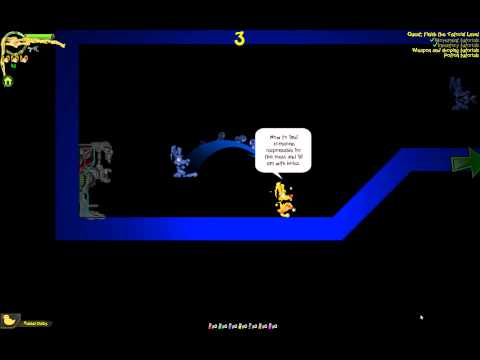
We pretty stoked that Toxic Bunny HD has been greenlit. To be fair we never were confidant it would, but we super excited at the opportunity this represents. We putting a list of things we want to improve together and the highest priority if our tutorial. Its really not good enough and since its the very first thing players experience we want to make a lot of improvements (hopefully without rebuilding it from scratch).
So with that in mind I am asking you guys for any feedback (constructive if it can be, but feedback either way). We have put a walk though of the tutorial online to review. We have a list of improvements we plant to make but the more comprehensive the better.
Thanks for your time.
Comments
Only comment is that the water isn't visible.
Perhaps just add a little backdrop... greyish on the tutorial. Just a suggestion.
So my big question is what happens when someone dies?
The bit with the jump in the start. The spikes are not really hard to get past the jumps just before are really are too hard. Its not clear watching Nico play that bit. I am considering redoing those jumps and perhaps pulling the spikes out entirely. Its not really meaningful the way its done now and we end up frustrating too many beginners right there.
Thanks for the feedback.
In terms of minor aesthetic suggestions, it might be worth considering changing your currency to something made up (e.g. Simoleons, Zennys, Buckazoids, Bottlecaps, Gil) since that would better suit a fictitious cartoony environment rather than dollars.
Also under the shop you've got Expresso - is that purposeful or did you mean Espresso? (Expresso being the early morning show on SABC 3)
@Rigormortis - Hehe, love that show!
I'd also suggest putting in additional extras in the level that players can see beforehand, but only reach if they display a bit of mastery with the game's controls and/or systems. Spelunky does this really well in its tutorial. So I'd suggest leaving the water potion thing out of the official tutorial path and having your water area have an exit before players would start drowning, but have an obvious side passage that is so long it'd mean players drowning before they get to some sort of prize area that's visible from the before they even enter the water the first time.
I do apologize for never actually playing Toxic Bunny, despite being aware of it forever.
Anyways I feel the point where you get the guns needs to be more exclamated. Maybe putting the gun in a downlight to make it more of a moment.
Agree with the icons being confusing and it might be too rough to have to use a potion the first time you swim, maybe make an island you can breathe in between.
Following up on the mastery bit, maybe have a cave with something you need to use the potion to get.
Good luck
Maybe just use the arrows for indicating where to jump and the Item icon when it is relevant.
Having pictures of toxic bunny on the hints makes it hard to distinquish, or is just these old eyes of mine.
@pantsula Will re-look at the graphics for the semi visible toxic bunny for the jumps. Not sure how a down lighter might work for the waepons perhaps we can put the quest arrow in.
Thanks for the feedback.
We have a new promo video for Toxic Bunny HD. To be honest its a shame we didn't build one like this right at the start of our greenlight campaign.
Immediately this game brought up nostalgic feelings as I reminisced about a very old/retro game called Jazz Jackrabbit.
I like the retro art style and the monsters look cool. I would definitely like to give it a try sometime.
Thoughts to tutorial video:
The neon blue borders and black didnt really work in my opinion and kind of made it look a bit "cheap"/old school (Gave the impression that the developers didn't bother designing a "real" level for the tutorial run...)
The water wasn't clear at all...maybe it was just the video or the laptop i watched it on but I think it could "stand out" more.
The present exercise felt a bit weird as well...I was confused as to why you would give a monster a present..Maybe explain why you do these things..
In the throwing part I would recommend using a bigger monster as a target (For the dummies out there)
*OVERALL* Certain actions need more explaining and could have their own separate level (Jumping level, Present/Shooting/Throwing level, Potion level, Shopping+Everything together level?)
Thoughts to the promo video:
I like the narrative in the beginning but why does it stop at 20sec!? I think either use it throughout the whole video (Coffee, MORE COFFEE, EVEN MORE COFFEE! or leave it out completely and have the music carry the promo.
Also, I think there are a few too many headings: Focus on the important aspects that make the game look awesome (The 3x coffee heading is funny but maybe a bit too much)
And one last thing: The cuts in the video are way too quick.
-> this game has a lot of little details and generally there is a lot on the screen to take in so either have the cuts longer so the viewer can completely soak in whats happening (surroundings/monsters/actions/weapons) or maybe have less stuff happening/in the frame...there were so many frames were I was a bit confused what was going on...
It still looks crazy fun but tutorial and promo are the 2 first impressions that people get of the game and they should be simple to grasp and portrait the coolest features of the game!
I think that it is important to realize that with a game so close to release like this one, you should always try and put into perspective the changes that is possible to make in a short time.
With regard to giving a monster an exploding present, just watch many many Warner Brothers cartoons to see the references we pulling from. We know some jokes are missed by some people but explaining jokes ruins them for the people that would enjoy them.
Here we see Bugs giving Tazz an exploding meal for example.
Dropping the talking early on letting the story tell itself. Of course since Toxic Bunny doesn't talk we dropped in the text. As for the repeated comedy on the Coffee thing I think getting a giggle is worth the risk. In hindsight we might have added an outro of dialog. Not sure what we would say yet might rework it if something comes to mind.
Thanks for your feedback.
Sadly I got hit in the face with a deadline shortly after starting. Still, very glad to see TB has been greenlit.
Damn fine job guys ... keep it up. 8-}