
A new demo build has been uploaded. Get it here: http://dl.dropbox.com/u/23376639/zX-Demo.rar
New features include:
Infinite loop mode added, where the player tackles as many randomly selected levels it as possible before dying.
Completed level counter added for infinite loop mode.
Reworked and improved boss encounters.
Charge attack meter.
Player momentum improved.
Adjusted and streamlined pause and options menu.
Level exit portals added to the entrance of regular levels.
Numerous bug fixes.
Enjoy :)
Greetings all,
After implementing some great suggestions (thanks @BlackShipsFilltheSky), not to mention squashing numerous bugs, I am pleased to finally present you with the official demo of zX.
The demo features 11 playable levels out of the 66 total (excl. hidden levels).
Xbox and generic gamepad support has been integrated into the game. Xbox (and Logitech) settings are on by default. Generic gamepad users can change this setting in the options menu or the pause menu.
Keyboard controls can toggle between WASD (fire, blade & weapon select) / Arrow keys (movement) and Arrow keys (fire, blade & weapon select) and WASD (movement) which can be adjusted in the options menu or the pause menu.
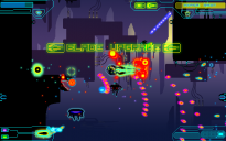
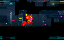
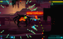
Several new enemy types have been added.
New hazards have been added to several levels.
...and the game finally has music!
If you haven't yet done so... please vote on Steam Greenlight
Website: http://games.pandawlf.com/zx/
New features include:
Infinite loop mode added, where the player tackles as many randomly selected levels it as possible before dying.
Completed level counter added for infinite loop mode.
Reworked and improved boss encounters.
Charge attack meter.
Player momentum improved.
Adjusted and streamlined pause and options menu.
Level exit portals added to the entrance of regular levels.
Numerous bug fixes.
Enjoy :)
Greetings all,
After implementing some great suggestions (thanks @BlackShipsFilltheSky), not to mention squashing numerous bugs, I am pleased to finally present you with the official demo of zX.
The demo features 11 playable levels out of the 66 total (excl. hidden levels).
Xbox and generic gamepad support has been integrated into the game. Xbox (and Logitech) settings are on by default. Generic gamepad users can change this setting in the options menu or the pause menu.
Keyboard controls can toggle between WASD (fire, blade & weapon select) / Arrow keys (movement) and Arrow keys (fire, blade & weapon select) and WASD (movement) which can be adjusted in the options menu or the pause menu.
Several new enemy types have been added.
New hazards have been added to several levels.
...and the game finally has music!
If you haven't yet done so... please vote on Steam Greenlight
Website: http://games.pandawlf.com/zx/

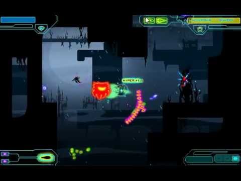
zX01.png
1280 x 800 - 184K
zX02.png
1280 x 800 - 196K
zX03.png
1280 x 800 - 139K
zX04.png
1280 x 800 - 183K
zX05.png
1280 x 800 - 201K

zX06.png
1280 x 800 - 201K
zX07.png
1280 x 800 - 91K

zX08.png
1280 x 800 - 169K
zX09.png
1280 x 800 - 226K
Comments
Though one can't be too proud of that Hotline Miami and DD were GM7
1) When in the options menu I had to press left to switch from the default settings to another one(like for scan lines). It's not a big issue, but it's counter intuitive which made me thought that there might be something else wrong.
2) The first time the game tried to save or something I got an crash. I attached a screenshot. I think it has something to do with folder permissions or something because as soon as I moved the folder it worked without any further crashes.
3) Some of the information boards show the same keys for shooting and moving, which might be confusing. For instance if I'm on the WASD/LRUD setup the board will show that W moves up and also that W uses my blades.
4) The ship feels a bit sluggish. It doesn't feel quite as responsive as I would like. I also don't like that it slows down when I fire. It's basically a permanent slow down to the ship because I tend to ALWAYS be firing.
5) This might be just me, but I'm having a hard time recognizing what bullets are mine and what bullets are enemies' bullets. Their bullets are mostly the same colours than mine, which I find confusing...
6) The "head" enemies that creep out of the wall are too subtle for me. I mean that I usually missed them appearing until the started firing. Would be cool if they had a less subtle entry, a sound alert maybe?
7) Come show this off at the meetup Tuesday :)
8) At one point I tried to run past a few enemies and there were a lot of bullets on screen which made my game lag a lot. There were a lot of bullets but I'm guessing that this will be a rather frequent occurrence. Might be a problem.
9) I think you should introduce the enemies in a more isolated manner. When the player first encounters an enemy I think it should be the only one they should be fighting so they can see exactly what the enemy does. If it's the later stages this can be relaxed, but I think the whole first world should work like this.
10) When you introduce the blade's reflect mechanic I think there should be a stationary enemy that fires a constant stream of bullets that are fairly easy to deflect. That way the player get's some time to practice.
11) I'm not sure about this one because it's funny for me too, but maybe consider getting rid of the profanity the little guy shouts. The reason I say this is that I know you are aiming to sell the game and the profanity might narrow your market.
12) The lazers are so cool! (the ones that scroll the sides of the screen :D)
13) The boss feels a bit too easy. He was a LOT easier than half of the levels I played through...and I couldn't even finish 5 of them. Also maybe consider playing some dramatic music when the player enters the level so they know something big is coming.
14) The enemies that spawn the energy to open the gates feel like they have too much health.
15) The menu animations feel too slow. I have to wait for the animation to finish before I can make selections. Which is not a game breaker...but it would be good to make it faster to make selections. Also when the options menu loads and I press down a couple of times it resets to the first selection once the animation has finished.
Well done! I think this is great! The enemies are really interesting and have some great animations. Keep on going :) Also, cool music.
@BlackShipsFilltheSky My computer sure was lagging in the video. I was desperate to get a video out.
@Rigormortis
1.) I agree. I wanted to get it working by pressing the fire button and not left/right, but couldn't get that working last night. Will fix it for the next update
2.) Not sure why it crashed 1st time, never seen that before.
3.) Oops, should be easy to fix.
4.) I think this'll just be a matter of taste. The slowdown while firing was a recent suggestion I implements.
5.) Not sure how I would make it easier to recognize the bullets... just watch out for brightly colored stuff I guess :P
6.) Don't think the head enemies are too subtle, they make the same teleport sound and fx as the other enemies.
7.) Will do :)
8.) This is indeed a problem. My most serious problem I think. Will need to find a way to limit the amount of objects on screen.
9.) Remember that the demo you're playing samples levels from all over the game, the final version will be much more forgiving in the first few levels.
10.) You'll get used to the blade in the first few levels (see above) and through constantly dying :D
11.) Fuck that (lol)... but seriously, I'll probably have profanity unlockable. Have the milder stuff first (Aaarrrgghh!!! first, then Pissflaps!!! after unlock.)
12.) I'm glad you like the lasers (inspired by Gridrunner by the legendary Jeff Minter (Llamasoft))) I love lasers <3
13.) Think you may be right about the boss. There are a couple of solutions to this, eg. it could spawn other enemies.
14.) Also think you may be right about this, think I'll half their energy.
15.) I'll speed the animation up and look at what's happening with the first selection in the options menu.
Thanks for taking the time to check it out and give me your feedback. Much appreciated. I'll keep you posted on changes and updates.
With the head Enemies, they only spawn on corners so it becomes some what predictable where they might spawn, they are also are don't spawn in different place.
Just remember death is your friend and constant companion.
Looks like it's come a long way even from the the Amaze fest :) Well done! :D
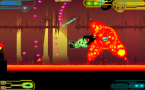
Redesigned player damage fx so that it no longer uses Game Maker surfaces, thus better performance and compatible with more Gfx cards.
Improved particle and trail fx.
Improved option and pause menu system, inactive selections are now skipped over, all selections toggle.
Reworked audio levels so that the BGM is now more prominent.
Added 2 new music tracks to the green forest levels.
New weapon, charge attack a-la R-Type (hold down blade attack to charge and release to fire). Comes in 3 flavors contingent on current primary weapon selection.
...and just to brag a bit, I got a Twitter recommendation from Jeff 'Yak' Minter! Very chuffed about that :)
For those too lazy to scroll to the top, you can download it here
Also, check out this preview video by SlushyPreviews
Well done.
Much prefer the newest version, much cleaner and a has such a great contrast with the dark colours. Good use of negative space :P
The initial levels were also more cavernous and free roaming where the new ones have more of a sense of direction to them which made a really big difference to the overall feel of the gameplay.
@retroFuture zomg old shield system fuck that makes me laugh!
Improved the random backdrop generator in Infinite Loop Mode, backdrops no longer repeat.
Tweaked logo animation in intro and pause menu.
Please note, I apologize for the poor saving system currently implemented, Julian (a much more professional coder than I could ever hope to be) is currently working on an improved and streamlined save system which will effectively save not only the standard level progression, but also Infinite Loop modes completed level scores. Currently, if the player exits a game in progress from Infinite Loop mode, the recorded score sets itself back to zero. Will notify you when this issue has been resolved.
Love the Parallex backgrounds. Will play more and comment on gameplay, but visually its great.
Will vote for greenlight now! :)
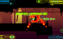
So I have had many little bugs and glitches on getting the game one. But this one actually made some nice art out of it. So enjoy the game-world being translucent since this will be the only time you will see it.
Also don't expect this build to stay up for too long, the CRT distortion on hit effect didn't turn out how we wanted so it's going to be changed, also need to get the 360 controls working nicely new build in about 12 hours I guess. Time to get a little bit of sleep.
Also a video of the effect (looks much better when actually being played.
Edit: just realized that I cut off the edges of the screen when I edited the vid :#
I assume there are health bars and stuff at the bottom of the screen? It might make sense to add attention animations to those when health is lost so that players link the two concepts. I was wondering what made you not die to the first few hits.
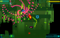
The black stars charge the Hyperblaster. We've debated over whether they should go to the player or the meter itself.
The reason why they go to the ship instead of the UI is because you charge the hyperblast by absorbing the enerfy of the enemies, but if that is confusing then we will move it to going to the UI instead.
Currently there are sprites there are animations on the ship indicating health loss, but ye I see what you mean, there should be some more attention drawn to the UI as well.
The reason they are black is because black is symbolic of the enemy unit's power, hence why their bullets have black cores, and the Hyperblaster's bullets also have black core (as the power to use the Hyperblaster comes from absorbing the black stars)
But as I said if it confusing then we will change it.
I keep saying that. Over and over :P
You could always change the glow colour of enemy bullets per level to make it stand out nicely from the background colour. Like 1 level all the enemy shots could be yellow to complement the blue background, the next level they're orange to stand out against a green, etc.
Have you had problems trying to fit stuff into "enough colours" given the styles of all the shots are graphically similar?
---
Also I think the colour changes could work rather well.
Pulling a page from my Pecha Kucha talk from AMAZE :P
They made all kinds of different attacks, but were able to very easily identify them from one another (which ones need to be dodged) with a very simple rule of colour that people understood instinctively.
You could use the same size/shape/movement coherence for player bullets too, giving you a much closer colour spectrum to play with on those - so player shots could all be very closely coloured in order to differentiate them from enemy shots, but the subtle variations in their colour could help players identify the mode that they're in right now. There are couple of ways to do that, personally I'd give the bullets all the same primary colour, but have them fade to different effect colours as they moved on, so it would be obvious by their trails which state you were in.
There's lots of ways the colour can be used very subtly to signify stuff. One of my favorite uses is in DDR, where all the arrows cycle through this crazy garish colour set as they scroll, so each arrow will - at some point of its life on the screen - be every possible arrow colour. The trick here is that relative arrow colour is important: Every arrow that's on the same part of the beat, is the same colour. This is consistent across every single song, so once you pick it up, you can tell how fast you need to respond to an arrow by it's degree of difference to the arrows around it. And yes, this information is also given to you by the arrow's actual physical location up the screen, but it's a secondary channel that helps reinforce timing information that you might otherwise miss when you're just pattern matching shapes and layouts of arrows.
Personally, I think that's genius. It's one of the key elements of the design of DDR that makes play at crazy high speeds possible and a huge factor in establishing those highly entertaining "flow" states that we all enjoy. (There are even different options on arrow cycling colours for colourblind players to give them maximum spectrum for recognition)
... Too much information? :P
Also yeah, I loved the way DDR felt more like you were just zoning out, staring past the patterns and just interpreting them almost unintentionally.
Like any good UI, you don't notice it till it's taken away ;)
So we've changed the enemy bullet colour to be consistent throughout, player bullets will be a while off until there is a colour change with them (read after rAge.)
Also no decal changes yet (sorry @Tuism)
But on the very plus side there is now screenshake on enemy kill, and bigger enemies give bigger screenshake (yay!)
Sorry that there is no new build but I need to poke Mike to fix the hyper-star in the UI before I upload a new build (though will likely also have some tweaks to the menu in final prep for rAge so it will be a bit odd.)
But thanks for the advice really good to get it so I'll hone those video editing skillz. (This one is less terrible than the last)
Also final build for rAge. Sorry that there are a bunch of the regular features that we cut out of the game. But it is intended for a demo PC at a show ;)